Employee Console Redesign: Internal platform redesign for employee management
Product Design
UI/UX
Design System
Overview
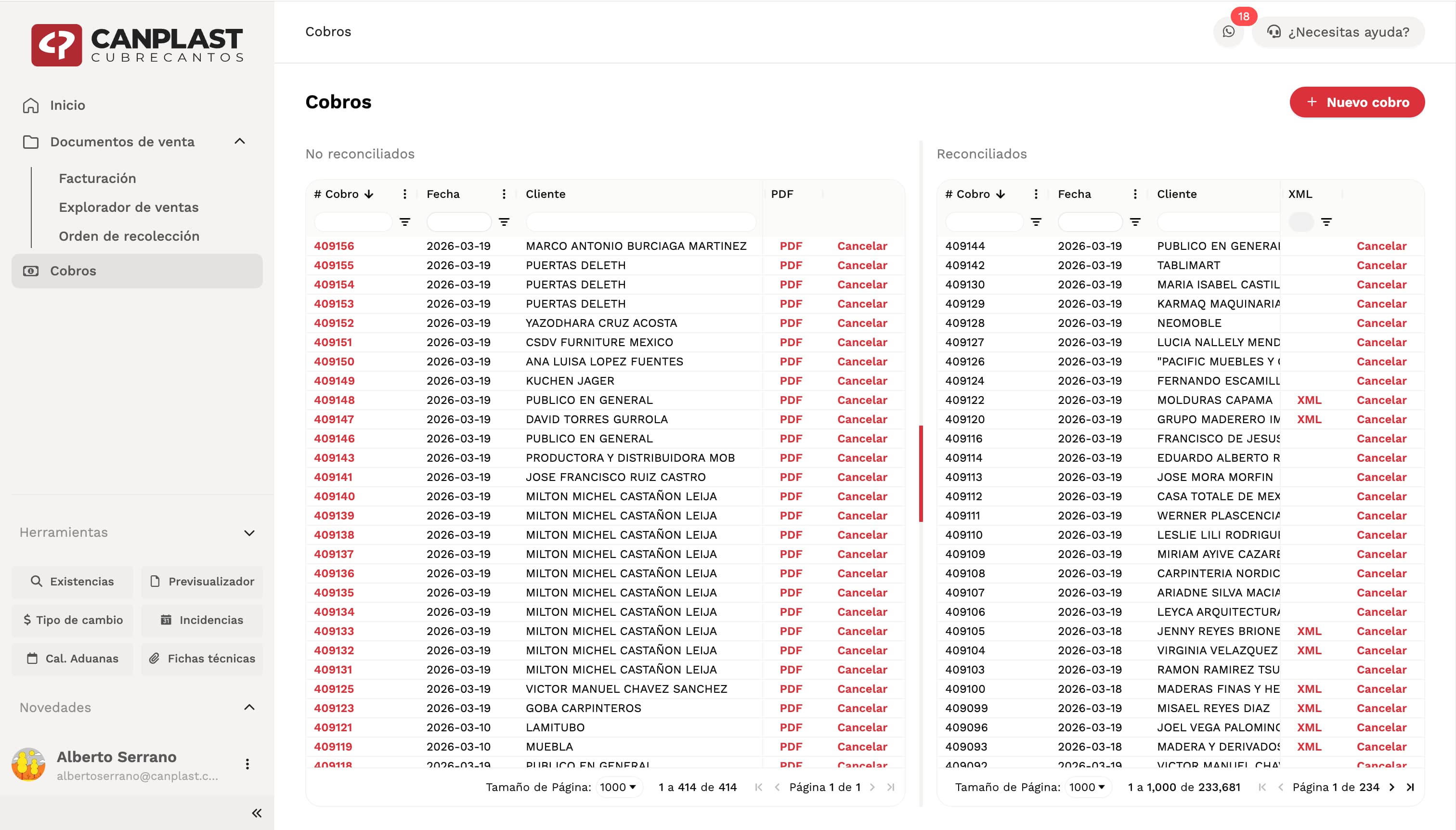
The company had an internal platform used daily by employees to manage operations such as orders, invoicing, inventory, and tracking processes.The system had been originally developed using Vue 2, which over time became difficult to maintain due to obsolescence and lack of modern tooling. As part of a major technical upgrade, the platform was rebuilt using Next.js with TypeScript.As part of this transition, I was responsible for redesigning the entire product from scratch and creating a new design system tailored specifically for this platform.Context
This is a core internal tool used daily by employees across different areas of the company. Its performance, clarity, and usability directly impact operational efficiency.The redesign was not only a visual update, but a complete rethinking of how the system should function as a modern, scalable product.Problem
The previous system presented several challenges:- Outdated technology (Vue 2)
- Lack of scalability and maintainability
- Inconsistent UI patterns
- Limited design system or visual structure
- Complex and sometimes inefficient user flows
Goal
The goal was to design a platform that is:- Clean and modern
- Scalable and consistent
- Efficient for daily use
- Visually balanced and easy to navigate
Approach
The project required building the design from the ground up.This included:- Defining layout structure
- Establishing color systems
- Selecting typography
- Creating reusable components
- Understanding user needs and workflows
Design Direction
The main inspiration came from products like Notion, where minimal design supports complex interactions without overwhelming the user.The goal was to achieve a clean and modern interface that could handle a large amount of information while maintaining clarity and focus.Layout & Navigation
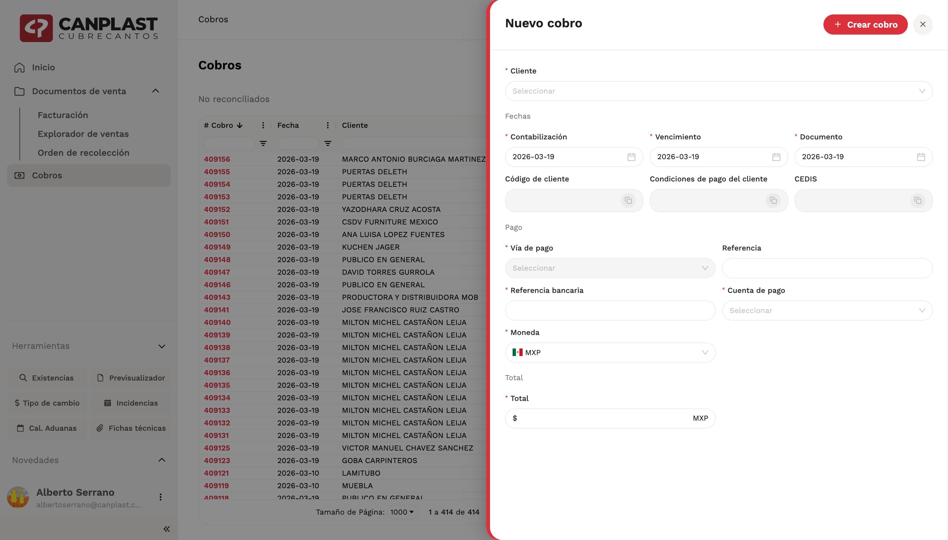
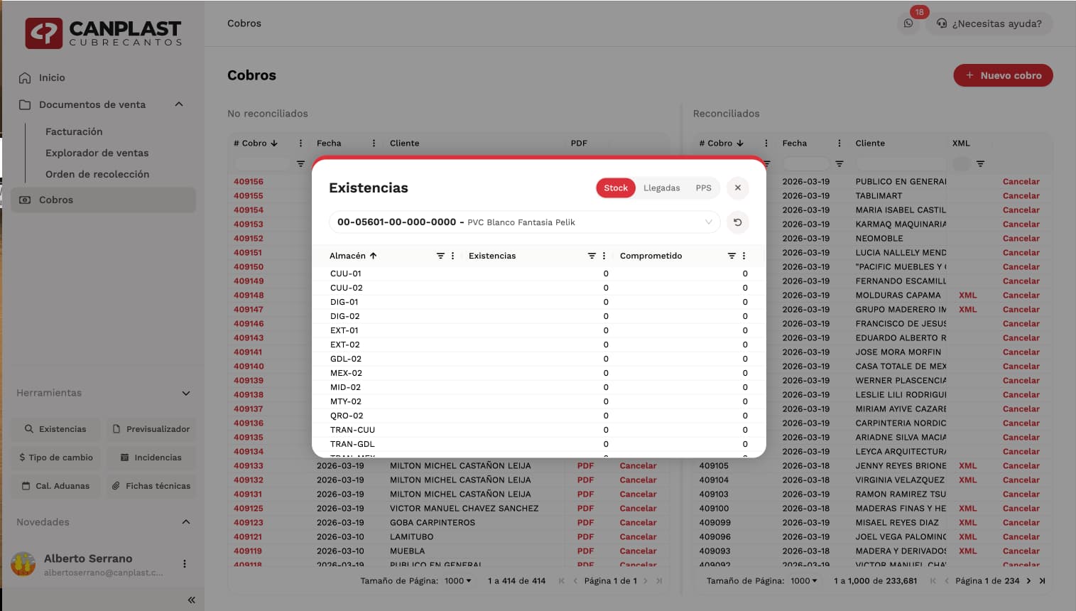
One of the key decisions was designing a dynamic sidebar.The sidebar became the central hub of the experience, allowing users to navigate quickly, access tools, search information, check notifications, and manage their session from a single place.It was designed to be powerful but unobtrusive, giving users fast access to everything they need while keeping the interface clean and focused.Special attention was given to motion, spacing, color balance, and interaction details to make the experience feel smooth, elegant, and intuitive.
Design System
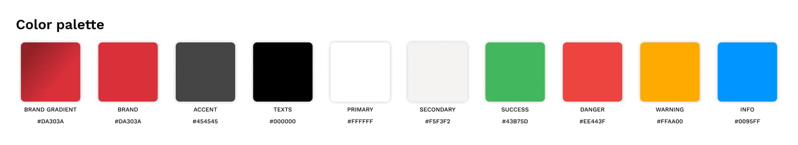
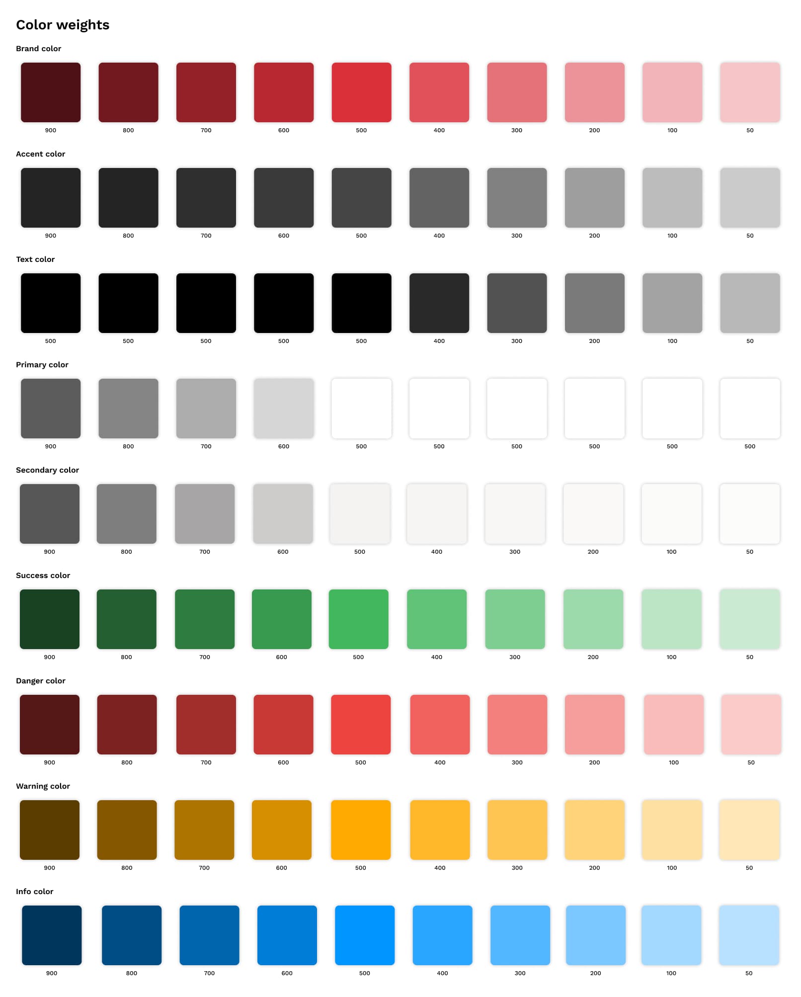
A complete design system was created to ensure consistency, scalability, and clarity across the platform.This system defined the visual language of the product, including colors, typography, reusable components, and interaction patterns.The intention was to create a modern interface that could scale over time without losing coherence.Color System
- Brand: #DA303A — used for primary actions and key UI accents
- Contrast: #454545 — used to support hierarchy and readability
- Base: #FFFFFF — the foundation of the interface
- Secondary: #F5F3F2 — used for subtle contrast and layout separation
Typography
Work Sans was selected as the main typeface due to its readability, versatility, and availability across multiple weights.It helped establish a clean and functional visual rhythm throughout the platform.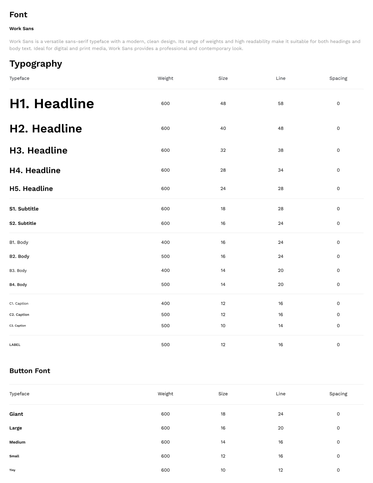
Components
Once the design direction was defined, I designed a collection of reusable components for the platform.This included modals, drawers, popups, and other interactive UI elements that needed to feel visually balanced, consistent, and aligned with the Canplast brand.The idea was to build a component library that was flexible, scalable, and easy to implement across the product.