FramaTech Website Redesign: Website redesign focused on improving usability and aligning with business needs
UI/UX
Frontend Development
Overview
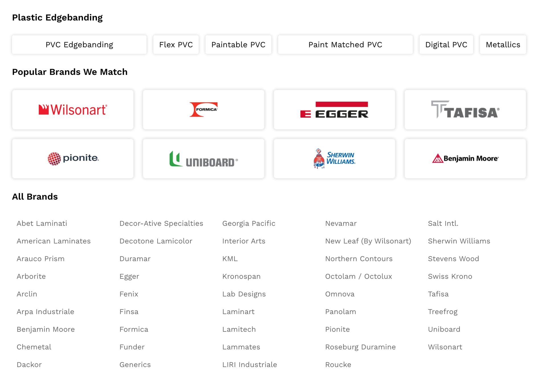
FramaTech is a U.S.-based company specializing in the production and distribution of edgebanding materials, recognized as one of the leaders in North America.I was responsible for redesigning the company’s Shopify website, creating a new experience from scratch that included navigation, menus, banners, collections, and overall layout.After designing each section, I implemented the solution using Liquid and Vue, building a fully customized experience tailored to the company’s needs.Context
The website serves as a key touchpoint for customers, providing access to product information, collections, and purchasing flows.The redesign required balancing usability, brand presence, and functional requirements within the constraints of Shopify.Problem
The previous website was built using a standard Shopify template, which presented several limitations:- Lack of flexibility to adapt to business needs
- Limited customization in layout and interactions
- Poor alignment with the company’s brand identity
- Suboptimal user experience for the target audience
Goal
The goal was to create a website that:- Improves usability and clarity
- Aligns with the company’s brand
- Adapts to specific business requirements
- Provides a clear and accessible experience for users
Approach
The redesign was approached as a fully custom solution.Instead of relying on pre-built templates, I designed each section individually and then implemented it directly in code using Liquid, integrating Vue where necessary to handle custom logic and interactions.Design Direction
The design was driven by the company’s customer profile.The primary users are often not highly familiar with digital tools, so the interface needed to be clear, direct, and easy to navigate.Instead of pursuing a minimal or experimental design, the focus was on creating a layout that feels intuitive, structured, and accessible.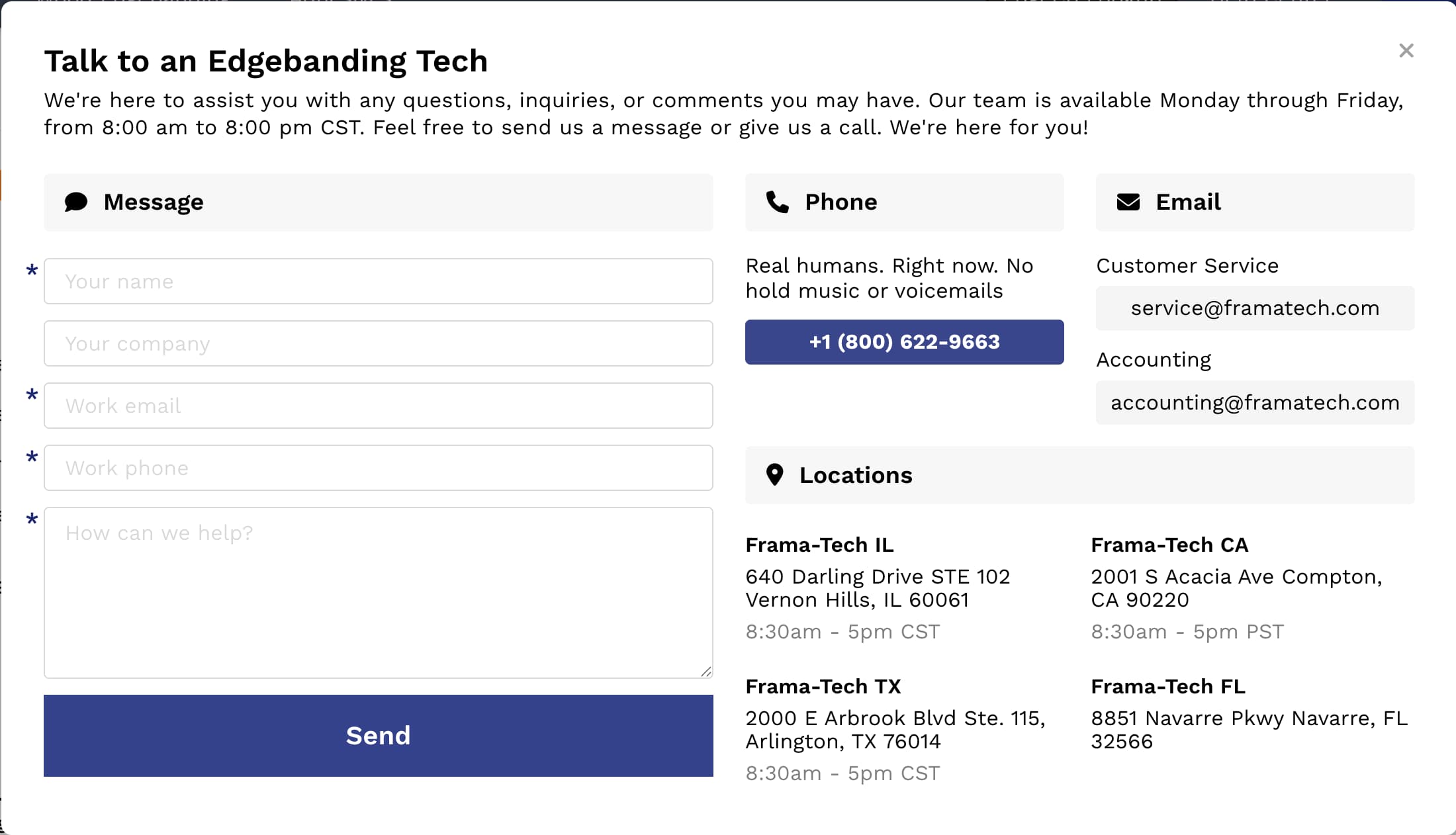
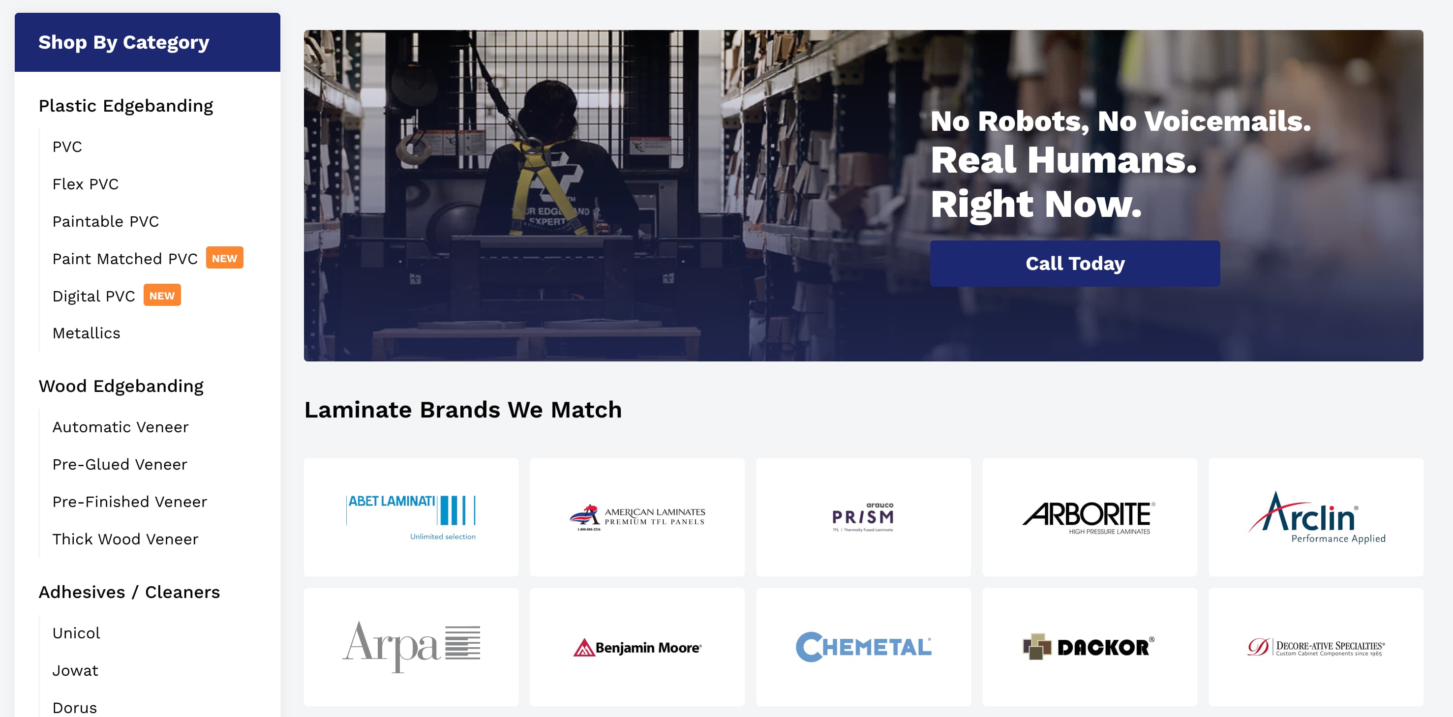
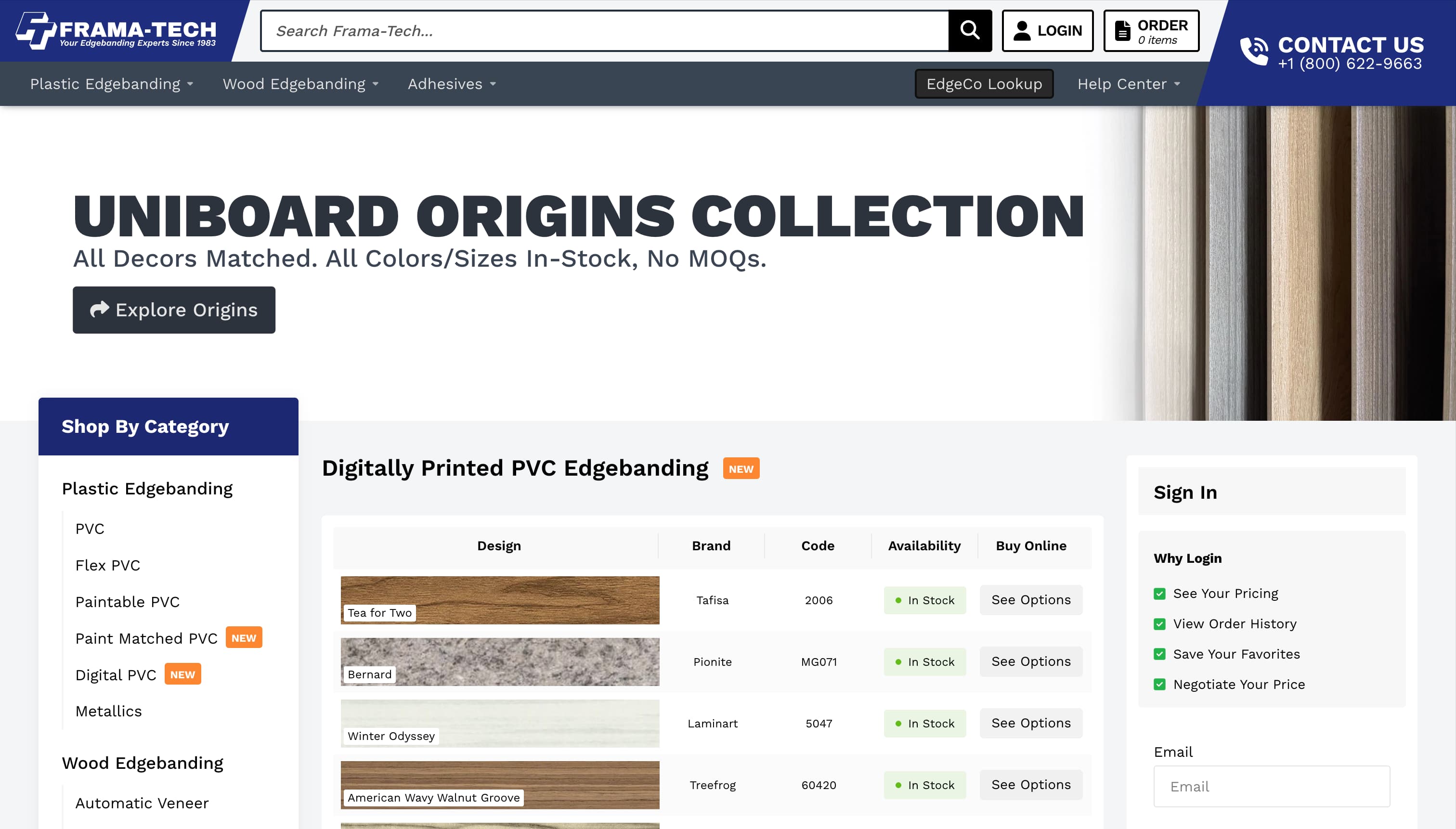
Layout & UX
The layout was designed to prioritize clarity and ease of navigation.Elements were intentionally larger, well-defined, and easy to locate, reducing friction for users and making interactions more straightforward.Special attention was given to menus, navigation flows, and product organization to ensure users could quickly find what they needed.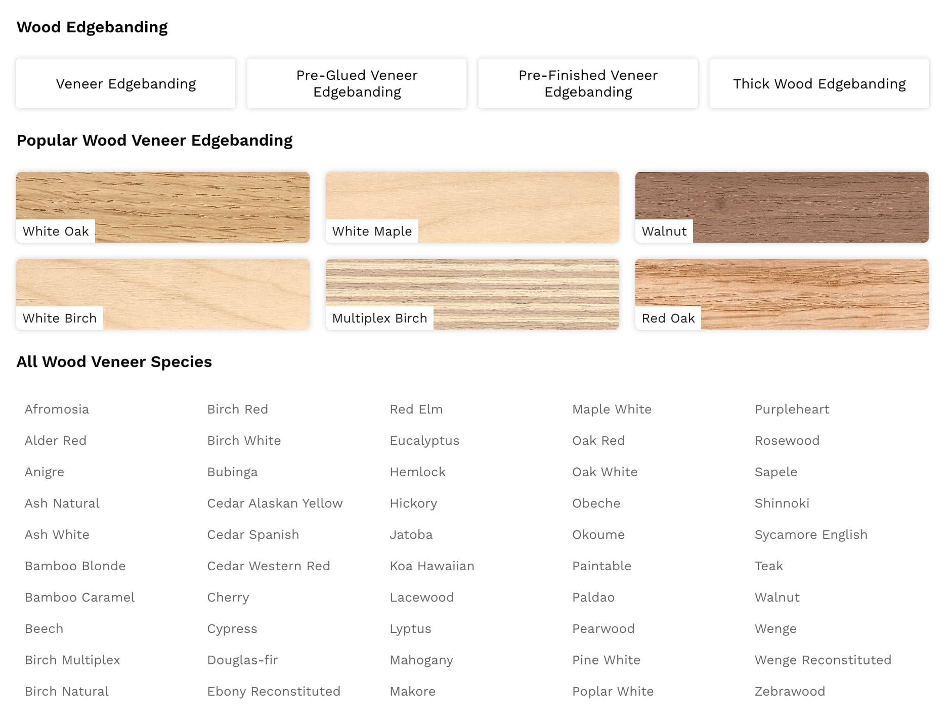
Visual System
The design incorporated the company’s brand identity in a subtle but consistent way.Colors, spacing, and visual accents were carefully applied to reinforce brand recognition without overwhelming the interface.The result is a balanced visual system that supports both usability and brand presence.
Components
All components were designed and developed from scratch.Due to the use of Liquid and the constraints of the Shopify environment, no UI libraries were used, requiring full custom implementation of each element.This included navigation elements, product displays, banners, and interactive sections.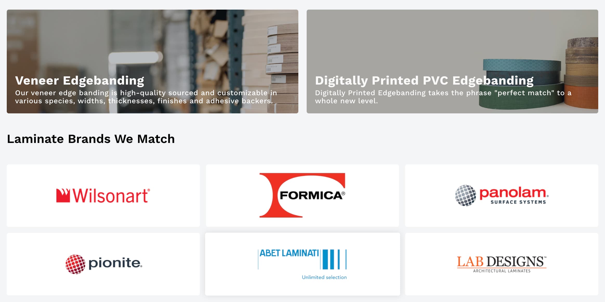
Development
The website was developed using Liquid, with Vue integrated for custom logic and dynamic behavior.I was responsible for implementing the design and ensuring that each component functioned correctly within Shopify’s architecture.