Modernizing a legacy brand while preserving its essence
Overview
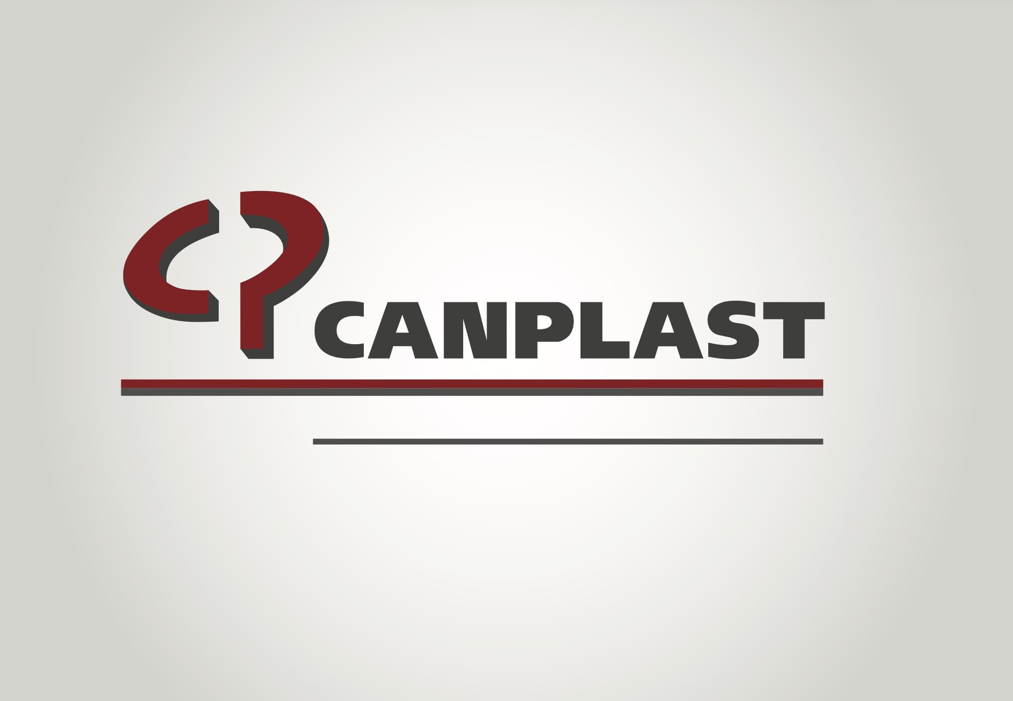
The original Canplast logo presented several challenges due to its outdated design and limited usability.I was tasked with redesigning the logo to make it more modern, versatile, and easier to apply across different platforms.
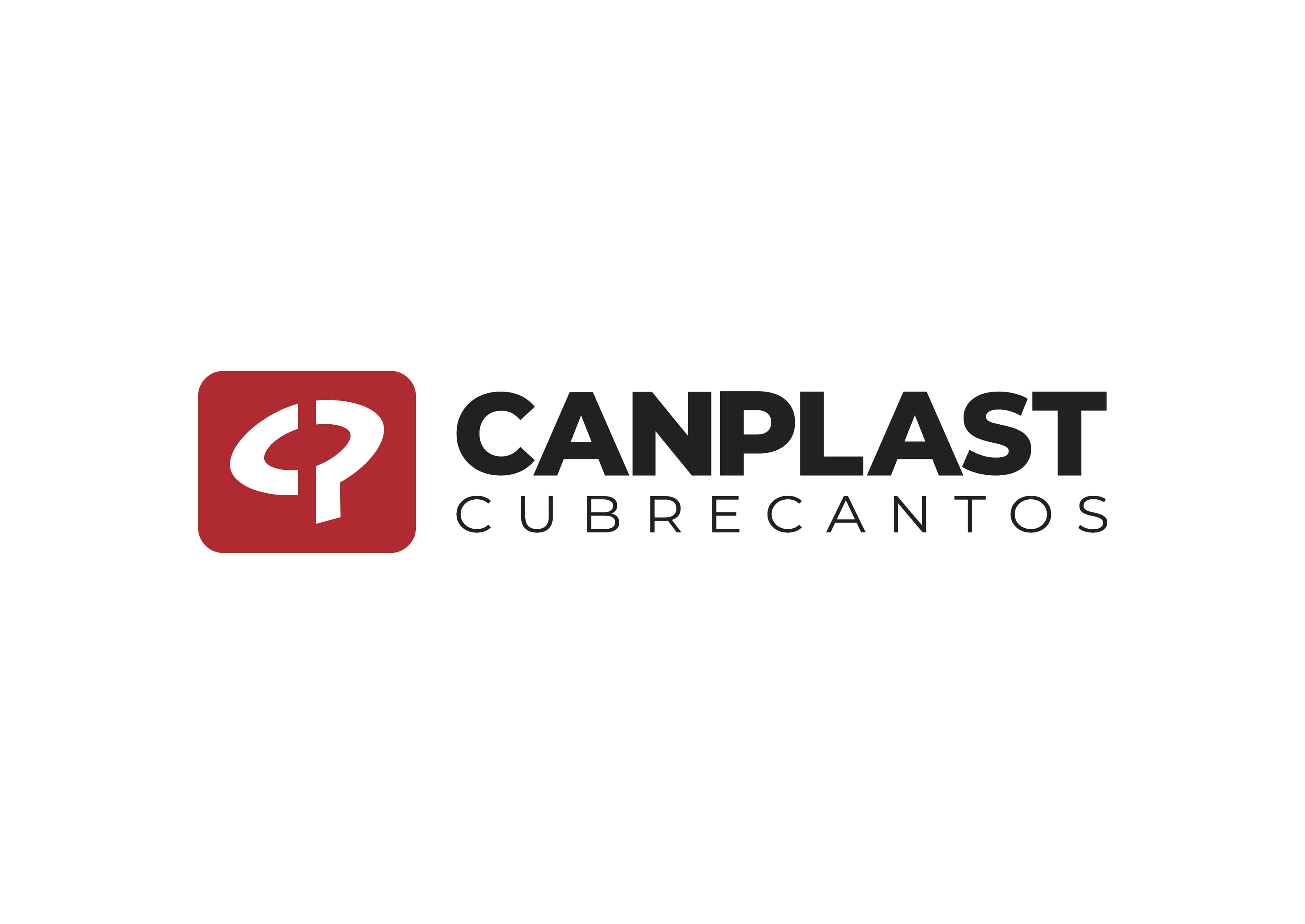
Old vs New
Problem
The previous logo was difficult to use in digital environments, lacked flexibility, and did not align with modern design standards.At the same time, the brand carried a long history, making it essential to preserve its identity.
Approach
The redesign focused on simplifying the visual structure while maintaining the core essence of the brand.Every change was carefully considered to avoid losing recognition or meaning.
Design Direction
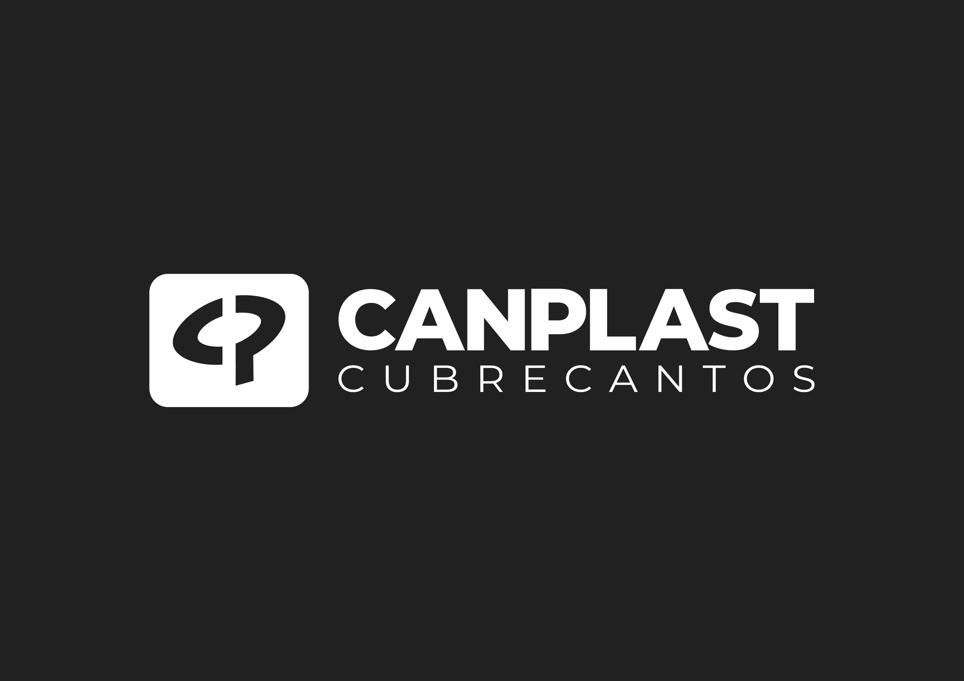
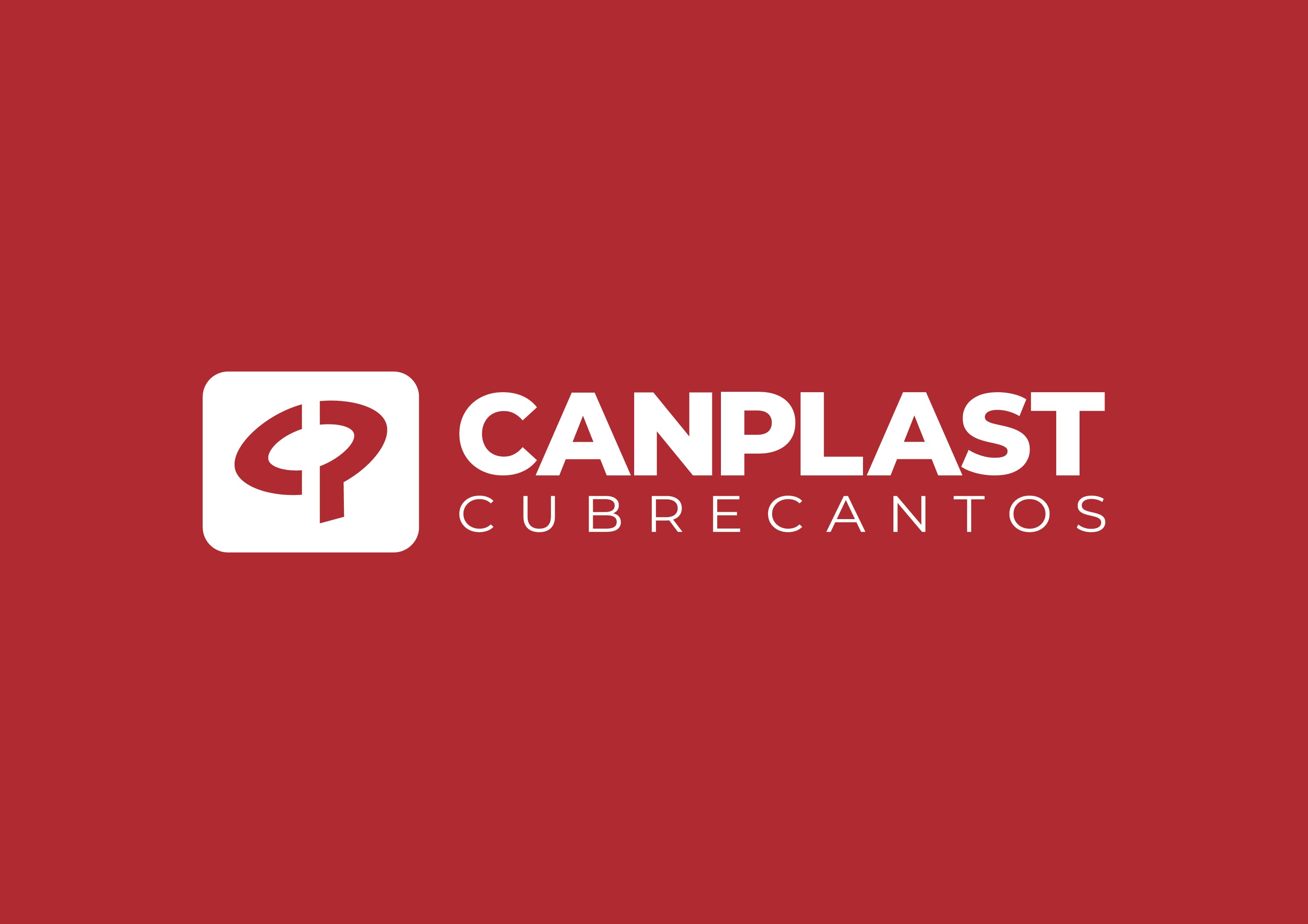
The new logo introduces a cleaner, more balanced form that works effectively across digital and physical applications.The goal was to create a timeless and adaptable identity.
Result
The updated logo improved usability, consistency, and visual clarity, allowing the brand to evolve without losing its identity.